Urgh, Canada!
The logo of The Canadian Press has been deeply perturbing me—because I am (1) a stickler for the mechanics within correct English grammar rules and (2) a typography and design tyrant.
I do get the point: the left and the right red fields of the Canadian flag were “cleverly” transformed into opening and closing quotation marks:
 © The Canadian Press. All rights reserved.
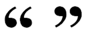
However, the journalists and writers who comprise the group (of all people) should have told the graphic designers that curly, curved, or smart opening quotation marks (also known as typographic or book) quotation marks look like a pair of commas that are rotated 180 degrees and raised to the top of the line, while closing quotation marks resemble commas that are also lifted to the top of the line. Both quotation marks should make one think of the numbers 66 and 99:
And when it’s a pair of single quotation marks or apostrophes—as in what The Canadian Press has in its logo—the marks should look like the numbers 6 and 9:
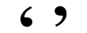
Therefore, their logo—had the quotation marks that they were aiming for been designed correctly—should have looked like this instead: